Rendering Paul Rudolph's 1956 Lost Design
- Tim
- Dec 8, 2017
- 5 min read

Imagine an architectural theme park made up of incredible homes designed by George Nelson, Paul Rudolph, Alden Dow and Buckminster Fuller. In 1956, that dream nearly became a reality. Naturally, we were intrigued. Read on to learn more about this project, and stay tuned to see how we bring one of the homes to life.

In 1956 a foundation was set up in Grand Rapids, MI, to plan and build an 'outside museum of houses' showcasing cutting-edge trends in architecture, construction and home goods. Called the 'Homestyle Center', the concept attracted notable architects and other creatives of the time to take part. Each would contribute designs for this unique project to be based around a small lake on land to northeast of the Frederik Meijer Gardens & Sculpture Park.
I read online there was a large collection of material about the Homestyle Center that had been donated to the Grand Rapids Public Library by Arleigh Hitchcock, the driving force behind the project. The collection is a fascinating accumulation of official papers, publicity bulletins and coverage in design magazines of the time.
Among the architects included in the group were George Nelson (Creative Director for Herman Miller), A. Quincy Jones and Frederick Emmons of Eichler fame, Alden Dow (Midland, MI's home-grown answer to Frank Lloyd Wright), king of the geodesic dome Buckminster Fuller and a young designer making waves by the name of Paul Rudolph.
Unfortunately, for financial reasons, none of the homes were ever built, despite all design work (architectural, landscape and interiors) having been completed. Many of the designs contributed to the project were modified or drawn upon and built in other locations.
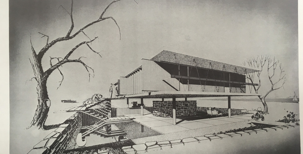
The design that caught my eye most was by Rudolph, who came up with a very futuristic design for a Floridian Gulf residence. The home could transform from a private, secure and still light-filled modern rectangle to one with no walls at all, completely open to the elements by way of raising the vertical wall panels into a horizontal position.
Only two renderings of Rudolph's design are commonly available online or in publications:

Poised on stilts (or pilotis), the house with flaps in raised position looks like a bird about to take flight. It is a larger and more ambitious version of his highly praised Walker Guest House.
As an avid 3d modeler, I began thinking about how I could create a model in 3d. This would require a floor plan, but the sketches provided a limited amount of information. A major question about this design was how it fit 3 bedrooms and 2 baths in such an extreme open plan layout. Furthermore, the design brief states it has 4 levels over 1600 square feet.
In the final document of the Homestyle Center collection, and after about 2 hours of reading, I discovered a floorplan for the design overlaying the rendering in an issue of Interiors from September 1956. This is the only floorplan I could find anywhere.
Turning a floor plan and some basic renderings into a full, modern and detailed rendering with specific measurements is no easy feat. If you want to read through the nuts and bolts of how I deciphered the floor plan, determined module size and reconciled sketches and floor plans, carry on. If not, feel free to skip to the bottom of the post for the final product.
Understanding the Floor Plan
The floor plan shows a main perimeter floor area (level 1) at entry that offers 3 directional choices:
1) Continue left to the living area and a large sunken conversation pit (level 2) and dining area. The perimeter offers yet more seating options. The kitchen is the walled area around the corner from the dining table.
2) Head up the stairs to the first/master bedroom (level 3) that is in a raised position overlooking the living area. perhaps a foldable screen would wrap around the perimeter for more privacy. The master bath is in the utility core to the right.
3) Turn right to head to the bedroom wing which is closed off via pocket doors. Partitions at approx 6' visually separate but do not completely close off the 2 bedroom areas. Stairs behind the first bed lead down to a bathroom and storage (level 4), also accessed from stairs next to the kitchen. A large desk is positioned behind the second bed partition. Storage is located between the bedroom and kitchen.
Figuring Out a Model
Using both the sketches and floor plans, I set about figuring out the 3d model. This was not without a few problems as there are significant discrepancies between the two documents, including:
• The number of modules both on the long and short sides are different in each (17x10 in the sketches and 16x11 in the floorplan). I chose to follow the floorplan.
• The floorplan shows the level changes clearly, although the stairs behind the first bed partition would have changed the size of solid volume so I omitted them from the model.
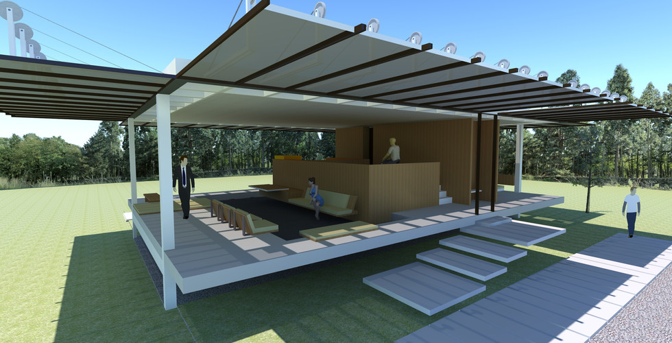
• Some of the built-in furniture is unclear in both sketches and floor plans, so I took some artistic license with the long sofa to complete the conversation pit.
• I included the long cabinet in the bedroom section even though it is absent in the floor plan simply because I liked it!
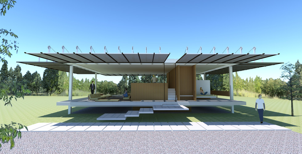
• I kept the floating stairs in the sketch for the same reason.
• The design brief also mentions a perimeter skylight that would help illuminate the interior when the wall flaps were closed. This is shown in some but not all renderings.
Key Problem: Module Size
The house was designed on a floorplan of 16 modules long by 11 modules deep. In order to work out the module size I focused on the flaps, particularly the ratio of width to height based on the sketches which is approximately 1 : 3.3. Typical (based on standard material sizes) modules of 2', 2 '6 and 4' were ruled out for their own reasons:
• At 2' the resulting front door width is too narrow, the perimeter walkway would also be too narrow and the height of the panel wouldn't allow a person to stand comfortably on the raised level. At 2'6, while the door width was acceptable, if a bit narrow, the ceiling height and square footage problems remain.
• At 4' the 13'2 ceiling height seemed excessive and the square footage would far exceed what was stated in the report (2816).
• At 3' (9'9" max ceiling height) it seemed to work just right with a comfortable front door size, perimeter walkway and the base square footage matched closely with that stated in the report (1584 compared to 1600).

Anyway, enough geeking out. And now a disclaimer: I'm not an architect, engineer or particularly good woodworker. I made a lot of design choices based on the information I have and made a nice 3d model. I'm sure there are errors and many things you may have done differently. I just wanted to see the design come to life. I hope you enjoy it! I certainly enjoyed the challenge of making it.
Watch the video with 3D fly-through below or scroll down to view individual photos in the gallery.
I would love to make a video that shows the flaps opening and closing with changing time of day and sun exposure etc. At the moment this is beyond my capabilities! If you would like to collaborate, please get in touch via contact@trystcraft.com.
Also, if you would like to build this design, get in line!
You are welcome to share these images. I just ask that you credit me: Tim Hills at www.trystcraft.com and link to this post. *note I originally rendered the video with original music but was it didn't come out as I liked, so I chose one of the Youtube free-to-use songs on there. The music is not mine.
Huge thanks to the Grand Rapids Public Library for the opportunity to look through the fascinating collection and allowing copies/photos to be made. Thanks must also go to Arleigh 'Bud' Hitchcock for keeping the collection safe and donating it to public use.
I used Sketchup 2017 to create the model and SUPodium to render the model.


