Galloway's Furniture by Victor Lundy: 3D Recreation
- Tim
- Mar 6, 2018
- 3 min read
Updated: Mar 9, 2021


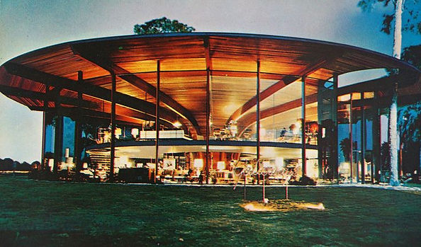
In 1959, a leading modern furniture store in Tampa sought out visionary Sarasota architect Victor Lundy to create a showroom that would make people stop and stare. Nicknamed the round house by many who worked there, the design for Galloway's Furniture showroom was based on Lundy's love for nature and organic forms.

The following 3 rarely seen images are from the December 1959 issue of the Architectural Forum. Thanks to George Smart and the NC Modernist library for these.


Massive laminated beams recall the stems of a morning glory flower and window walls almost 20' high gave the structure an otherworldly appearance. Lundy went one better and hung a mezzanine floor from the beams, making it appear to float in space. Then, he designed two floating staircases hung from the suspended mezzanine floor. Beautiful redwood decking ran from the base to the tips of the beams, leading the eye around the building. One major feature noted in the Architectural Forum article is that the entire space was a display area with no storage space needed as all furniture was either stored off site or made in the nearby Galloway's furniture factory. Outside, existing pine trees were incorporated into the design with cut outs or 'nostrils,' as Frank Lloyd Wright called them, allowing their trunks to poke through.

Roof 'nostrils' allow existing trees to remain and ground the building to the site.
This design was truly architecture as art! I'm sure as many people stopped to enjoy the architecture as the furniture, if not more. Lundy's design is genius and owner Ralph Galloway's choice of architect Victor Lundy an inspired move.

Main showroom floor under the floating mezzanine.
Click below to watch an animated fly through video of the 3d Model

Aerial view

Like many other unique mid century modern buildings, the Galloway's Furniture Showroom it is now completely unrecognizable. While it is still standing, all the windows are boarded up, completely hiding its original structure.

The good news is that is the Ringling Museum has purchased the property with a view of eventually restoring it to something resembling its original state. That would be amazing!
Slideshow of period images from the Tampa Bay Tribune Feb 14th ,1960 and Florida Memory Photographic Collection:
How I Created the Model
I built this model in Sketchup using a preliminary plan published in Progressive Architecture Jan 1959. There are slight differences from the actual built structure such as the position of the staircases being moved to the outside of the floating mezzanine section.
I estimated measurements using the typical length of a dining table (6') and suitable staircase width (4'). The 16 laminated beams are set on a 12' diameter circle, the floating mezzanine is 16' wide and the main level is 12' wider, 4' inside and 8' on the outer edges. These measurements gave proportions as close to the plan as I could get - no measurements are readable from the scanned pdf. I think the actual building's measurements are slightly larger, but the proportions worked for my model.
I created a beam using distance from the inner circle to the perimeter at a height of 18', setting a curve which would allow a person to stand on the inner edge of the mezzanine level without hitting their head.
Limitations of the 3D Model
My beam is not as sculptural as Lundy's and should probably be a lot deeper to take the load, but it gets the structural idea across. It was also difficult to get the texture to follow the curve of the beam which is why I just have the laminations going one direction. In many of the renderings I removed the main windows to get a better view inside the structure. I also omitted a guardrail on both edges of the mezzanine level for clarity. I also just noticed I placed the cubicle or perhaps restroom on the wrong level! It was an exciting project to build a model for as you really gain an insight into how the structure is put together and what is required to make it work. This must have been a very challenging build for the contractor...or perhaps the magic of Lundy's design is its simplicity.

Source: Progressive Architecture, Jan 1959 p125.
I recently found another plan showing location of services in the central core in the Dec 1959 issue of Architectural Forum:

Thanks to Sarasota Architectural Foundation's Janet Minker and Donna Kacmar for sourcing the plan.
Look for Donna Kacmar's book on Victor Lundy to be published Nov 2018 by Princeton University Press.
Update 9/30/2018
I recently came across these two photos of the building under construction which not many people will have seen before as I found them in old newspaper articles while researching online.

(Tampa Bay Times April 2 1959)

(Tampa Tribune Aug 30 1959)
Read more about Galloway's Furniture and the fantastic mid century modern designs by Mel Abitz here.


